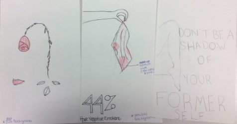
- The purpose of my design is to convey that women can, and should, feel powerful and confident without makeup. Looking at the statistics, many women feel uncomfortable without makeup or wear it because they feel as though they have to. My motivation for this design is to target young girls and help them feel confident in their own skin.
- I will have veils, or sheets, over my posters to show that women are uncomfortable without makeup in public places and to get the audience to look closer at the posters and read the messages. The audience will have to lift up the veils to see the posters in their entirety to fully understand the message.
- For the pictures I am keeping them in their original colors to convey that they are as real as the people viewing the posters. As for the backgrounds, I am keeping them with monochromatic pink to show the genders that are targeted through makeup advertisements.
Friday, June 9, 2017
Final Project Check-Up Questions
Tuesday, June 6, 2017


Friday, June 2, 2017


Thursday, June 1, 2017


Wednesday, May 31, 2017

Frankenstein Project

The Photoshop tool I used the most was the quick selection tool. That tool helped me select the flowers from their original picture and put them onto the hedgehog or scattered around the grass. The quick selection tool also helped me take the hedgehog out of its original background and place it in front of the pond.
Tuesday, May 30, 2017


Wednesday, May 24, 2017

Juxtaposition

I used a black and white image of a city and a very colorful image of a beach with big rocks and a sunset in the background. To create the visual interest in this piece I used the contrast from the colors of the two pictures. I created the jagged looking mask in illustrator and then copied and pasted it into photoshop. I then selected the mask and put the beach sunset picture into it. The brief idea behind this piece is that the world centers around the city and people who live and work in the city.
Monday, May 22, 2017


Monday, April 24, 2017
Typography Poster
 I made this poster look like the quote by using blues to show the stream the fish are in and used orange as a complimentary color for the color scheme. I made the letters of "flow" follow the "current" in the background to make it resemble the meaning. I also warped the letters in "dead" as well as the "h" in "fish" with the warp tool to resemble fish bones. Lastly, I broke apart the background to propose the background is also going with the flow of the current and I made them grey and put a shadow behind them to show that they are also dying and are now separate from the background. I wanted to portray the idea that people who mindlessly go with the current societal norm are acting like dead fish that don't go against anything (the current). The pieces that broke apart from the background can be interpreted as all the people in the world that go mindlessly with other people's ideas.
Tuesday, April 18, 2017
logo word
Hackneyed - (of a phrase or idea) Lacking significance through having been overused; unoriginal and trite
Monday, April 3, 2017
Friday, March 24, 2017
Typography - Stable

1. Shape - The font is block-like.
2. Color - The letters (for the most part) have solid fills and the "S" has a yellow to red gradient to propose that when people become rich they often become "evil".
3. Orientation - The letters in the background are parallel to the bottom and top of the page. and are evenly spaced from each other
4. Style - The letters are in bold to show support.
5. Texture / Fills - The "S" has a fill of coins to suggest financial stability.
Typography - Quiet

1. Size - The big lettering suggests that quiet people have a lot going on in their minds but usually keep it to themselves.
2. Shape - The font is swirly to suggest a quiet voice that isn't harsh.
3. Background Fill - The background is black to suggest nothingness because nothing is being said if someone is quiet.
4. Style - The stroke of the letters has a streak-y effect to suggest someone whispering.
5. Color / Value - The low opacity of the letters, again, suggests a quiet voice.
Typography - Implied

1. Shape - The font is swirly and not harsh to show that something implied is not in your face.
2. Color - As an ironic effect, something that is implied is not as obvious as black and white.
3. Size - something implied can still be said directly but someone might have to piece it together.
4. Effects - The words are reflected upside down to show that the words are still there but the viewer needs to pay attention to figure out what's happening. The same goes for the letters in the background. They are less opaque and even though all the letters to spell the word are there, the viewer still needs to read carefully to see the word.
5. Background Fills / Word Fills - The background is a gradient and the words have a 3-D effect to show that something implied can have deeper meaning that what is being said or shown.
Typography - Loud

Techniques:
1. Size - The letters are big.
2. Shape - The font used is block-like and warped to suggest sound waves.
3. Background Fills - The background is in your face with a repetitive "loud" pattern.
4. Color - The colors used are part of the split-complimentary color scheme and are vivid for a "loud" effect.
5. Effects - The 3-D effect, again, suggests loud speech.
Monday, March 13, 2017


Book Project: Pg. 4 Color

Book Project: Pg. 3 Patterns

Book Project: Pg. 2 Lines

Thursday, March 9, 2017
Book Project: Pg.1 Gradient

The emphasis of this design is the word "unconscious". This design relates to my theme of the human psyche because it represents the unconscious void of it. No one knows much about the unconscious part of the brain so I wanted to represent the darkness of it with a gradient warp.
Monday, March 6, 2017

Subscribe to:
Posts (Atom)